
I was excited to volunteer to provide all of the design assets for WordCamp San Diego 2018. As a native San Diegan, I grew up close enough to the Miramar Naval Air Station to watch the Blue Angels practice from our roof. There’s a long history of military tradition in San Diego that I wanted to honor. I came on board right after WCUS, a lot later than the rest of the organizers, and the first thing the team needed was a logo—preferably yesterday 🙂
The Logo
Because we were working with an extremely tight timeline, I decided to use stock photography as the basis of our logo. I stockpile tons of Depositphoto credits, so I started my search there. I initially thought about using military patches as the cornerstone of the camp.
This was my inspiration board:


*Note: Roll over the images for links to the stock image site.
First round logo comps
I played around with a few versions, changing the type and some colors, but I just wasn’t feeling it.:
I did really like two of the type vectors I’d discovered in my stock image research, and had used on a few badge designs.


It reminded me of something I’d seen in a book I inherited from my Grandpa. He served in WW2 as a Merchant Marine, ferrying troops and equipment in the Pacific Theater, and after he died we found his original training manual out in his toolshed.
On one of the mimeographed handouts crammed inside he’d used a pencil to try out the name stencil he’d been issued. Over the years, sitting crammed in that box, the graphite had transferred to the cover. It really inspired me to pursue a new direction.
I also really liked the simplicity of the sergeant stripes and star icon used in the first two badges, so I aged it a bit and roughened up the edges in Illustrator to match the stencil vibe. I eventually settled on four variations of a logo (and put them on t-shirts to see what they looked like because that’s what I’m most excited about!)


After presenting the above ideas to the organizing team, we came to a consensus: we’d use the horizontal logo in the first image for horizontal applications, and the vertical orientation in the last image when it fit into a design application better than the other.
The logo was done, which meant it was immediately time to jump into the website!
Website Design
Website Direction #1: Textures
Originally, I thought of the stencil as being something stamped on different surfaces, like crates and canvas duffel bags and the side of airplanes, the way my Grandpa stenciled his name in his training manual.
![]()


It just seemed boring, and it was really hard to find textures that both worked as full-size background images and had enough contrast to make the logo highly readable. This concept was abandoned early one, which bummed me out, because I was really excited about it.
Website Direction #2: contemporary real-life photograpy
I briefly considered using stock images of the military. The first problem I ran into was one of diversity: a search for women in the military disappointingly turned up either nurses, military wives welcoming their husbands home, or semi-naked fantasies holding big guns. There were very few photos of regular women serving their country.


My wife also came into the room while I was working on this direction and said “No. You’re not designing a recruiting pamphlet. Start over.” Since my favorite art director never steers me wrong I trashed the comp and got ready to start over again.
Website Direction #3: Historic
After two failed directions I was starting to sweat it. We really needed to get the website up, but nothing was really clicking. Nothing, that is, until I started looking through my Grandpa’s training manual. I was really inspired by small details we’ve lost in modern times: hand drawn logos and typography, single color printing and silkscreening, halftone patterns and the beautiful color and texture of aged paper.
I love vintage designs, specifically WW2 Propaganda posters. But there was no way I was going to be ble to hand-pint and letter as many posters as I’d need in the time I had available. If I was going to go down this road, I’d need to find images that met three criteria:
The image must be in the public domain
I didn’t want to infringe on anyone’s copyright, so everything needed to be in the Public Domain. Wikimedia really came to the rescue finding images that were available for use.
The image must be as diverse as possible (which, admittedly, wasn’t a lot)
The 1940s weren’t exactly the most diverse time in America when it came to advertising. While I was able to find several images of women to help balance our gender diversity, there was a distinct lack of any people of color. In all of my searching I found one image featuring an African American man that was far too small to use.
I also needed to make sure I did my research and limited my source material to Allies, and avoid any of the subtle racism (or not so subtle–jeez Louise can we be terrible) contained in a huge number of posters I came across in my research. I believe one image (“The Men Are Ready”) is Canadian, but the rest were designed for an American audience.
The image must be large enough to be used as a full-width website background (at least 1920px wide)
This was actually a lot harder than you’d link. There are so many gorgeous posters out there at 200 pixels wide. After several days of research I was able to compile a good variety of gender-balanced images that could be used:


_I_want_you_for_U.S._Army._1917._101_x_76_cm._(Coll..Nr._3116).jpg)
.jpg)
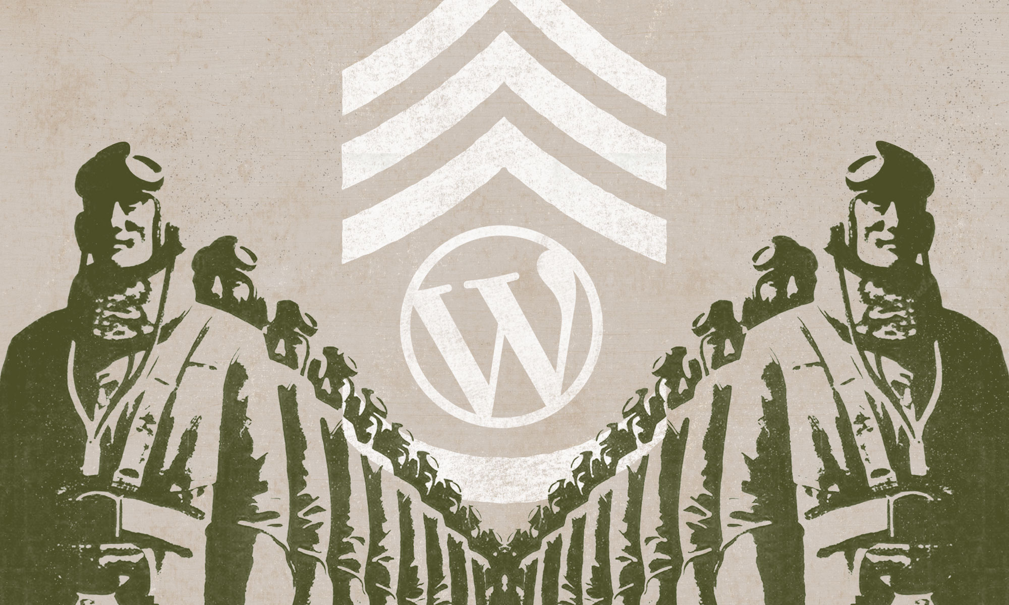
Making it work
Because of the lack of available hi-res images I developed a more street-art method of displaying the images, by blowing out the contrast, printing them in one color, and distressing them to look like they were printed on an old press.
I decided to juxtapose those vintage elements with the rough stencil type of the logo, using the WordPress logo, the WordCamp San Diego logo, and a “Community. Core. Commits” tagline that riffs on the old “Duty. Honor. Commitment” brand used by the U.S. Army.
Here are the final graphics developed for the site (and eventually signage) using the images above:


Overall, I’m really excited about the swag and signage opportunities that hve been opened up by this design direction. Check back next week, and I’l share the technique I used to turn less-than-optimally sized full-color poster images into single color vintage illustrations.
Great stuff Chris! Looking forward to seeing it all in person.
Love that you told the story behind the design!! Beautiful work, Chris.
Beautiful job on the site!
I don’t see your follow up post for the technique – I was looking forward to reading it. (“Check back next week, and I’l share the technique I used to turn less-than-optimally sized full-color poster images into single color vintage illustrations.”)